Small Collects is what I once wrote on a box of stuff that had either been sent to me over the years or I'd found or bought on travels. This is a subset of infrequent posts that feature my personal collection of ephemera and creative publishing outputs.


of functional illiteracy through these pages,
all told with compassion.


Here's the thing: you might have noticed above that Booklyn had the aim of putting out a few of these a year. That's waaaaaayyyyy too ambitious, especially with their other activities. As it went, they did one a year, maybe two if things worked out. I was talking to a young artist a year or so ago who had decided to publish his own journal. When I asked how often, he said quarterly. I told him to aim for bi-annually and see how he went. He looked at me as if I was undermining him, but it's advice from long experience. It's a lot of work, not just for the artist but for the production, distribution, and admin. Everything takes a lot of time, more than you expect, and lots of energy (and money). You also need a stable team of entities who are as enthused as you are and are either paid or encouraged by excellent leadership. That's rare. And valuable. Hat tip to Booklyn for all their hard work.
And a kiss-blow to Karen, who is a beautiful human being.
Warrior Writers: Not my enemy, 2008. Cover 235 x 158 mm, photograph by Garett Reppenhagen. Textblock 228 x 152mm, trace paper endpapers, 48pp (numbered), all B&W. Images by IVAW workshop members. Drew Cameron, Toby Hartbarger, Sholom Keller, Aaron Hughes, Justin Cliburn, Mark Wilkerson, Ei Wright, Fernando + Maria Braga, Jon Turner, Phil Aliff, Cloy Richards, Matt Howard, Vine Emanuele, Mike Blake, Paul Anbernathy, Mark Gordie Lachance, Garett Reppenhagen, Saqra Wallace, Nathan Lewis, Hart Viges, Jared Hood, Jeff Key. Introduction by Lovella Calica. Interior design by Felice Tebbe, cover design by Stacy Wakefield Forte. Cover printing by Earl at Kallameyn Press and Sara Parker at the Booklyn Studio. Binding by Booklyn Open Studios. Page printing by McNaughton & Gunn. Funding by Puffin Foundation. ABC: Another Booklyn Chapbook series No. 7. Edition no: 5/1000. NY: Booklyn Artists Alliance.

Know your ABCs: Another Booklyn Chapbook series
Sometimes, as I said a few posts ago, small collects just arrive. When I moved into Flat Life, I downsized and packed things up, and I had a few lovely months of being a minimalist, but stuff accumulates, doesn't it? Especially when you have a pronounced fondness for materiality, like I do. I don't collect clothes, or knick-knacks, I just end up with books and printed things and small non-commercial oddments that catch my eye. If someone likes something as much as I do, I'll sometimes give it to them, trying to practice non-attachment, but I'll often miss keenly the little things that wear out and break: an excellent pencil, a favourite soup spoon. Here's a story of how I end up with stuff.
The other day, I got a parcel from a friend called Karen Vernon. She too pronounces her name with a long A. She lives in the Blue Mountains and lives her life to the fullest, with a couple of dawgs and a fire-fighting man. We share an interest in having a diverse life, and have lots of odd little shared experiences: we have both been life models, for instance. I met her years ago when she came to a book class at the Sturt Winter School; I was told that I had a special needs student and so they were moving my class from a dark second-floor classroom painted moss green (so you couldn't see any small details around mid-afternoon) to a lovely sunny ground-floor weatherboard cottage with a ramp and the sound of the chook-pen next door. Karen rocked up with her walking cane, dragging her foot a bit, and proceeded to make my week really fun with her open smile, excellent sense of humour, and can-do attitude. We've stayed in touch every since, and she has stayed creative, although doing more writing now than making, as her hands aren't very good with small movements. Karen has MS, and she lives with it so gracefully. She lives life at the pace that she wants to, and pushes hard for her right to live as she damn well pleases.
So. This parcel was a complete surprise and actually a guilt trip because it reminded me that I'd missed her birthday (I'm blushing as I type this... memory and me are unmixy things: Happy Birthday lovey). Maybe she's giving up things every year too? I opened it up and there was a fun Gough Whitlam 'It's (tea) Time' mug made by one of her friends who trades as Mount Vic & Me (I remember once seeing the MV&M Penny Wong tea-towel in a gift shop in Berry and feeling very tempted). And there was a big kitty paperclip bookmark (that's the sort of thing I'll love for a while and then give to any child who visits and also falls in love with it), and then there was these:

*CLASPS HANDS*
Hi Duckie! A little parcel of stuff -- for no reason. ... The books are from a crowdfunding thing for BOOKLYN a few years ago -- they want to come and live with you.
O hai Booklyn books! You look scrumptious. I want to live with you too! There's not a lot online about you: this, written by the irrepressible and indefatigable Marshall Weber, which states:
Booklyn's ABC (Another Booklyn Chapbook) series, publishes three to five (short to mid-size) manuscripts per year by emerging and established authors and artists. Published works under the ABC series aim to meld fresh and inventive literary content with the tactile experience of handmade editions . . . bringing artist books to the literary world at a reasonable price. As a small independent publisher we advocate for freedom of expression, freedom of the press, and we are committed to supporting dissenting, provocative and controversial literature. With the ABC Series we are committed to expanding the diversity of our audience, by publishing emerging artists and authors of every race, class, ethnicity, religion, age, gender expression, and sexual orientation.I don't know if they're still publishing them. These are gorgeous samples of their work. They have 2-colour letterpress-printed covers (obviously using photopolymer plate), with the edition number stamped on via a commercial numbering stamp, and the inner pages vary from offset printed to lino printed. Each front cover, in classic Revolutionary Avant Garde Red and Black, allows space for the title and author, and has a pasted-on colour image. These particular books are editions 6 through 10, from various years. Let's have a closer look:


This one is from 2007, and is pretty self-explanatory.
I like the marked-up eggplant on the cover.
I bet eggplants didn't mean then what they mean now in social media.
The inside pages are either photocopied or offset printed, hard to know.

I love this one. I work for an arts program run at the University of Canberra
and this will be a wonderful resource for our writing stream.
It's got some great tactile features.

This is a layer of trace paper printed with handset letterpress
overlaid onto reproduced handwriting.

Here it is with the page turned.

A couple of pages along, saying in fine print that it was published in 2008.

A sample page that caught my eye.

The intro blurb, saying that this is part of the Warrior Writers Project.
All the contributors are listed at the back, along with their service record.

Each cover has little features. I love the V is for Veteran.
The last book had H is for Haiku, of course.
You can see the number stamp here.
This one was printed in an edition of 1000, as was the last book.

I know I shouldn't have favourites, but this one is soooo good.

That colour image wasn't pasted all the way down --
it's actually a flap, and this was under it.
I like this because Booklyn have made a shelf series
with a very strong graphic cover design,
and then they subvert their own design.
It's fantastic.

Handwriting everywhere.

Started 2006, completed 2009.

I'd love to reproduce it in full; it's a graphic work about illiteracy.
And pride. And shame. It's important work.

This is just one spread from one short story.
There are multiple stories of functional illiteracy through these pages,
all told with compassion.

And there's another thing I really like: a good colophon,
telling you all the production details, and with a bit of human realness,
in this case by pretending to use an ISBN :)

This is number 9, Idaville (2010), and it's got printmaking
gorgeousness. It's a short story and reproduced prints.
The front panel is a real print, using a sage-green ink.
I can tell its real because I can feel the texture of the ink
and the impressions of the plate under my fingertip --
it feels like wood-engraving, but it could be linocut.
I looked up 'Idaville, USA' and
there's one in Idaho, Pennsylvania, and Oregon.
I haven't had a chance to read it yet,
maybe there's clues in the images or text.
it feels like wood-engraving, but it could be linocut.
I looked up 'Idaville, USA' and
there's one in Idaho, Pennsylvania, and Oregon.
I haven't had a chance to read it yet,
maybe there's clues in the images or text.

The prints are just lovely. And the typesetting is elegant.

Look at those clouds. Just yummy.
Again, I wish I could just reproduce it all for you.

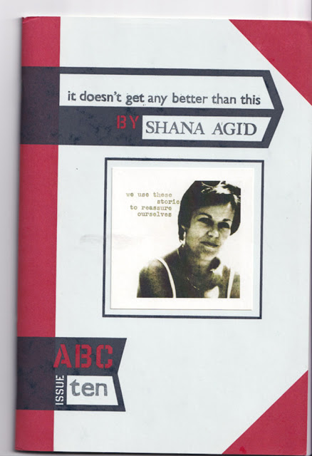
And finally, but not least, it doesn't get any better than this, from 2010.
That cover and author text is also plate letterpress,
judging from the marks on the reverse of the cover.

These are the material traces that I adore: marks left by process.
And I might replace those staples with a little thread stitch
before they do any more rust damage.

This page has been carved and printed in lino
and then reproduced via offset or photocopy.
The cutting marks add to the visual effect.

The centre spread. Again, reproduced printmaking.
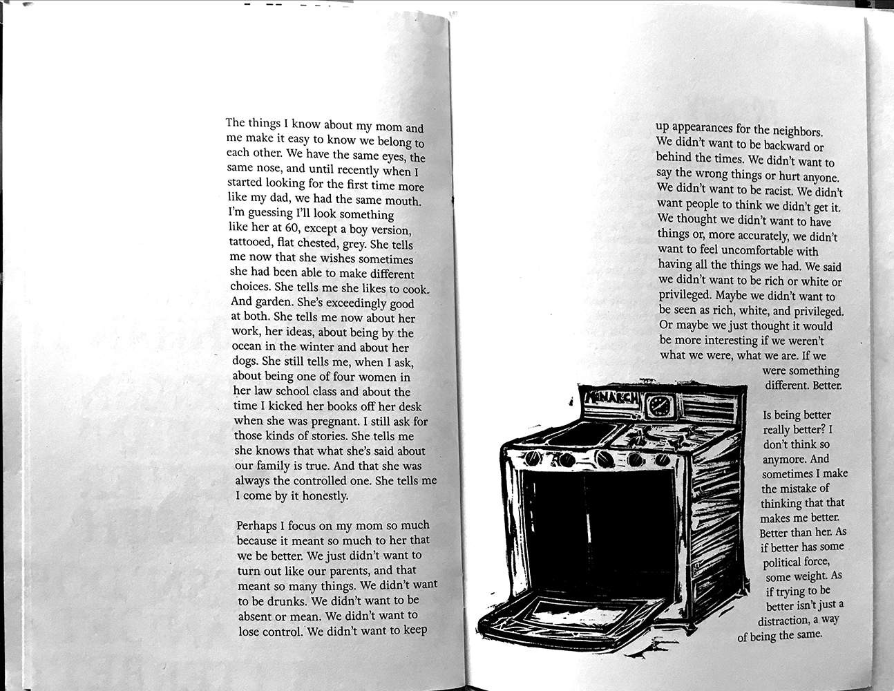
And it's a series of short stories with really nice spare text-image dynamics.
(Apologies for this image quality, I scanned it with my ipad
rather than my flatbed. I just couldn't leave the cooker out.)
(Apologies for this image quality, I scanned it with my ipad
rather than my flatbed. I just couldn't leave the cooker out.)

And, it looks like, interesting stories.
I'll find out soon, after my semester is over.
And a kiss-blow to Karen, who is a beautiful human being.
Colophon: 5 codex booklets, saddle-stitched (ie stapled), letterpress and stamped covers with tipped original colour illustration on front. Pages are offset. Gift of Karen Vernon.
Collectivo Haiku: Haiku not bombs, 2007. Cover 235 x 158 mm, photograph by Jason Workman. Textblock 228 x 152mm, 48pp (unnumbered), all B&W. No images. Tom Gilroy, Jim McKay, Shin Yu Pai, Grant-Lee Phillips, Allison Roth, Rick Roth, Denise Siegel, Patrick So. Book design by Phoebe Flynn Rich. Cover printing by Earl at Kallameyn Press and Sara Parker and Eliana Perez at the Booklyn Studio. Binding by Booklyn Open Studios. Page printing by McNaughton & Gunn. ABC: Another Booklyn Chapbook series No. 6. Edition no: 21/1000. NY: Booklyn Artists Alliance.
Warrior Writers: Not my enemy, 2008. Cover 235 x 158 mm, photograph by Garett Reppenhagen. Textblock 228 x 152mm, trace paper endpapers, 48pp (numbered), all B&W. Images by IVAW workshop members. Drew Cameron, Toby Hartbarger, Sholom Keller, Aaron Hughes, Justin Cliburn, Mark Wilkerson, Ei Wright, Fernando + Maria Braga, Jon Turner, Phil Aliff, Cloy Richards, Matt Howard, Vine Emanuele, Mike Blake, Paul Anbernathy, Mark Gordie Lachance, Garett Reppenhagen, Saqra Wallace, Nathan Lewis, Hart Viges, Jared Hood, Jeff Key. Introduction by Lovella Calica. Interior design by Felice Tebbe, cover design by Stacy Wakefield Forte. Cover printing by Earl at Kallameyn Press and Sara Parker at the Booklyn Studio. Binding by Booklyn Open Studios. Page printing by McNaughton & Gunn. Funding by Puffin Foundation. ABC: Another Booklyn Chapbook series No. 7. Edition no: 5/1000. NY: Booklyn Artists Alliance.
Charmaine Wheatley: 30% of Buffalo, 2009. Cover 235 x 158 mm, tipped cover image repro by the artist. Textblock 235 x 155mm, 40pp (unnumbered), full colour. All text and artwork by the artist: graphic comic style. Interior pages printed by Taylor Specialty Books, Dallas, Texas. Cover letterpressed by Booklyn Artists Alliance. Fake ISBN. ABC: Another Booklyn Chapbook series No. 8. Edition no: 146/1250. NY: Booklyn Artists Alliance.
Emily Blair: Idaville, 2010. Cover 235 x 158 mm, 2-colour cover overprint by the artist. Textblock 228 x 152mm, 40pp (unnumbered), B&W. All text and artwork by the artist: wood engravings. Cover letterpressed by Booklyn Artists Alliance. Funding from the Jerome Foundation. ABC: Another Booklyn Chapbook series No. 9. Edition no: 666/750. NY: Booklyn Artists Alliance.
Shana Agid: it doesn't get any better than this, 2010. Cover 235 x 158 mm, cover image by the artist. Textblock 228 x 152mm, 24pp (unnumbered), B&W, recycled paper. All text and artwork by the artist: linocut. Cover letterpressed by Booklyn Artists Alliance and Shana Agid. Page printing by Red Sun Press. ABC: Another Booklyn Chapbook series No. 10 (second edition). Edition no: 121/750. NY: Booklyn Artists Alliance.
POSTSCRIPT: I used this set to demonstrate to my Book as Art students (via a set of pretty dodgy videos) how to measure and make a custom slipcase. I stuffed up the first (fancier) attempt because I forgot to incorporate the Board Thickness measurement (BT), but the second one worked fine. Happily, another Booklyn publication fits (roughly) in the first attempt:

"Everything takes a lot of time, more than you expect, and lots of energy (and money)." You've said many wise things in your life, and this is one of the wisest. I'd print it on a tea towel if I had time
ReplyDeleteI'd use that tea-towel, as a reminder that I said it!
DeleteWHAT a treasure chest you opened - for you and for us.
ReplyDeleteDELIGHTFUL
ReplyDeleteLots of goodies in this. And that one with cooker...it reminds me of a small tribute page a friend made when Sylvia Plath died.
ReplyDeleteOh how lovely, Dinah
Delete